CASE STUDY
Your time,
well organised
Mobile CDV
⎯
Timetable App for Students
This case study has been developed as part of my bachelor's thesis. The inspiration for this project stemmed from my dissatisfaction with the version of the application offered by Collegium Da Vinci University.
Objective
The goal of this project was to completely redesign the current 'Mobile CDV' application, with a significant focus on improving the user experience and making the user interface more accessible and user-friendly for the students.
My role
I was responsible for overseeing the comprehensive redesign of the application. This encompassed addressing usability concerns, enhancing the user experience through extensive research, ensuring adherence to accessibility standards, and implementing a visually appealing design. I took charge of leading and executing the project from start to finish.
Aligning with the brand
Throughout the entire redesign process, seamless integration of the University's branding elements and color scheme into the design was prioritised. This entailed aligning the visual aspects of the application with the established identity of the university to create a cohesive and easily recognizable representation. Below you can find, the color palette and logotype of Collegium Da Vinci University.

Marine
#004D67
Sapphire
#00B6DC
Lemon
#FBCD28
User Experience & Design process
01. Audit
Application audit aims to find any vulnerabilities and suggest improvements to make it more accessible and intuitive for the user.
02. Benchmarking
UX benchmarking involves a comprehensive evaluation of the user interface. Identifies strengths, weaknesses, and potential areas for enhancement.
03. Persona
A user persona covers a wide range of needs and preferences, giving a solid understanding to help us create a better and more inclusive user experience.
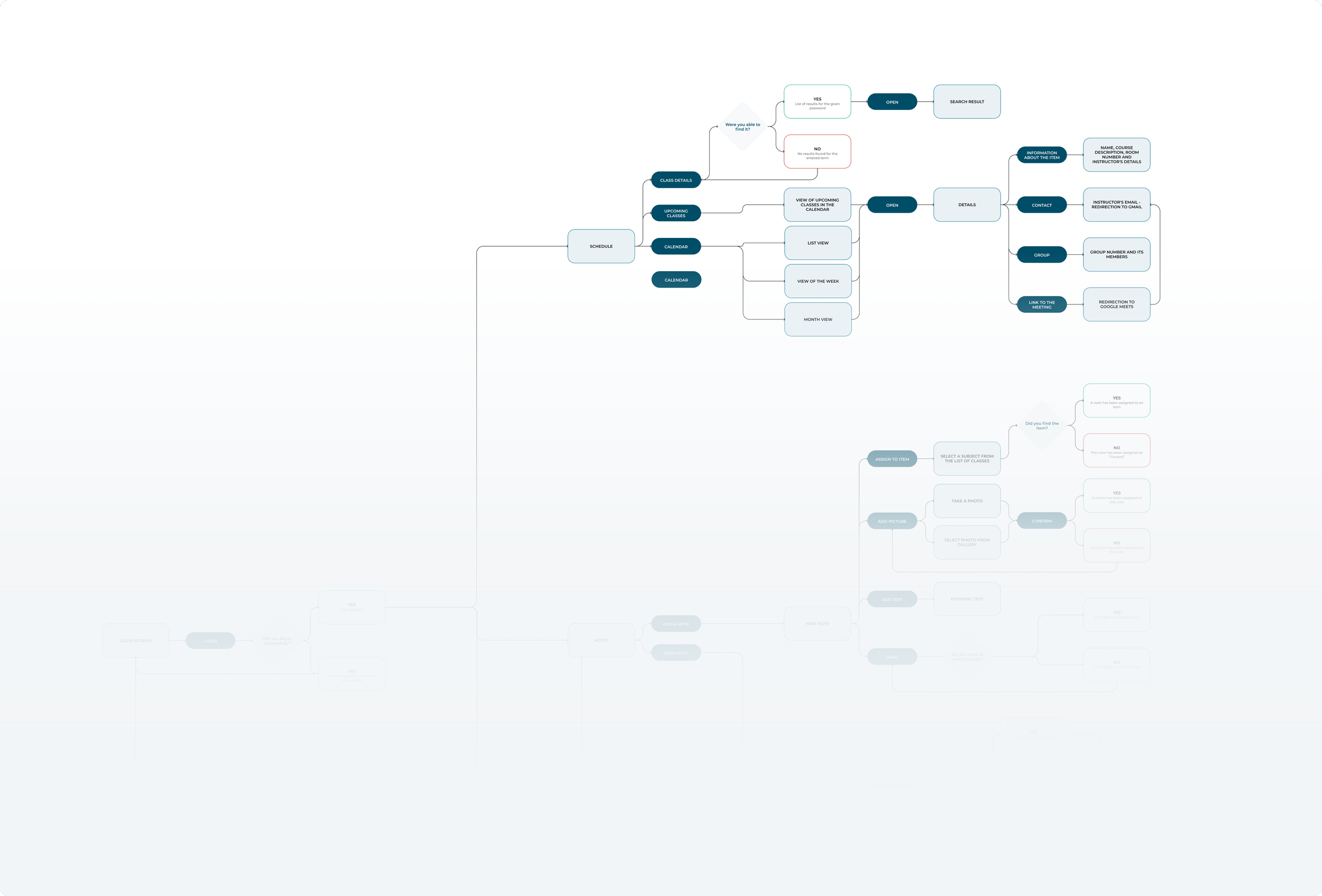
04. User Flows
The user flow outlines the various pathways and interactions, ensuring a cohesive and user-friendly experience by addressing diverse needs and scenarios.

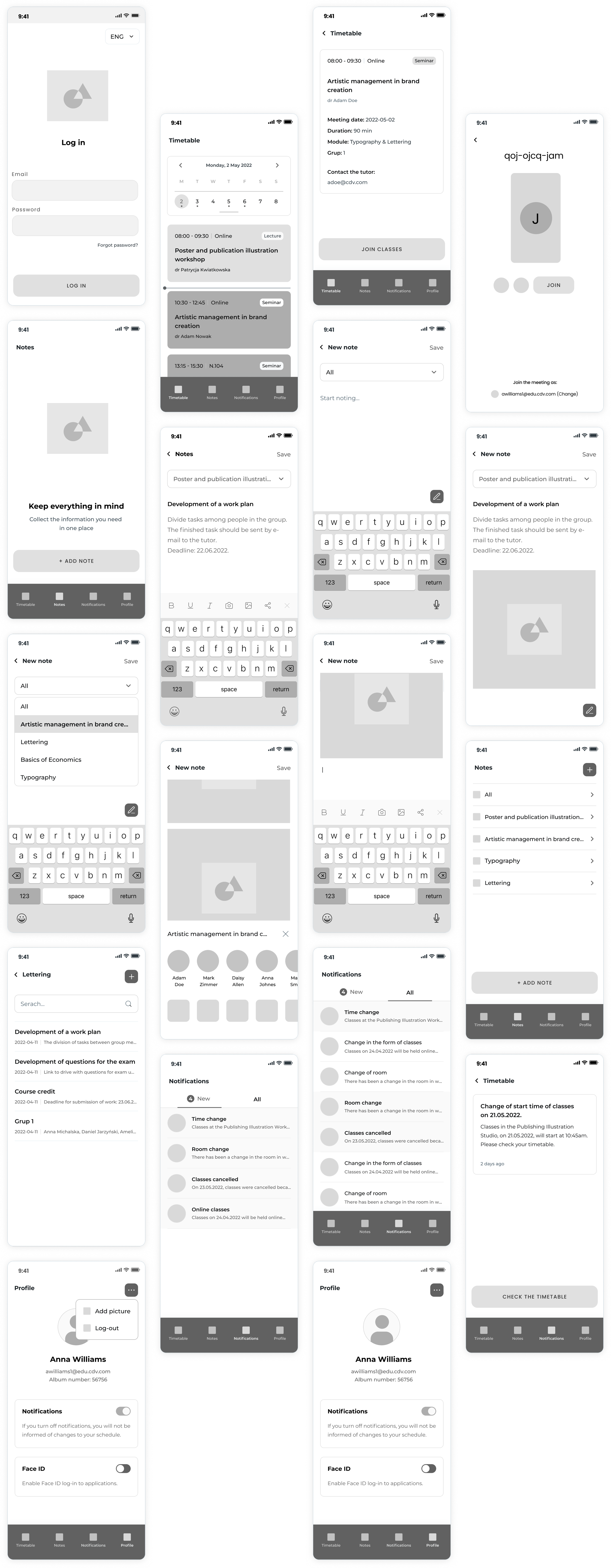
05. Wireframes
Wireframes serve as a visual blueprint, mapping out the fundamental structural elements and layout choices to establish a foundation for a user interface.

06. High Fidelity Design
High-fidelity designs include refined visual elements, interactive features, and a cohesive design language to bring the conceptual vision to life.


Issues to encounter & overcome
A thorough application audit was carried out, involving a meticulous examination of every aspect of the application. As a result, a summary was generated, identifying and listing all elements and functionalities that need improvement to enhance performance and user experience.
Please note that the application screenshots are in Polish, and as I can no longer access the application, I’m not able to replace them with English-language screenshots. Therefore, I have summarized the three most crucial issues that must be resolved.
UX & UI issues
Crucial aspects, such as clarity, accessibility, and readability were neglected, which caused a strong dissatisfaction and reluctance to continue using or recommending the application.
Lack of notifications
Users are left unaware of modifications, potentially leading to missed classes, appointments, or important events. Lack of proactive communication can create a sense of disconnection from critical updates.
Outdated design
An outdated application design can diminish the overall attractiveness, engagement, and perceived quality. Underscoring the importance of addressing this issue promptly to uphold relevance and user satisfaction.
BENCHMARKING
Competitor analysis
Google Calendar
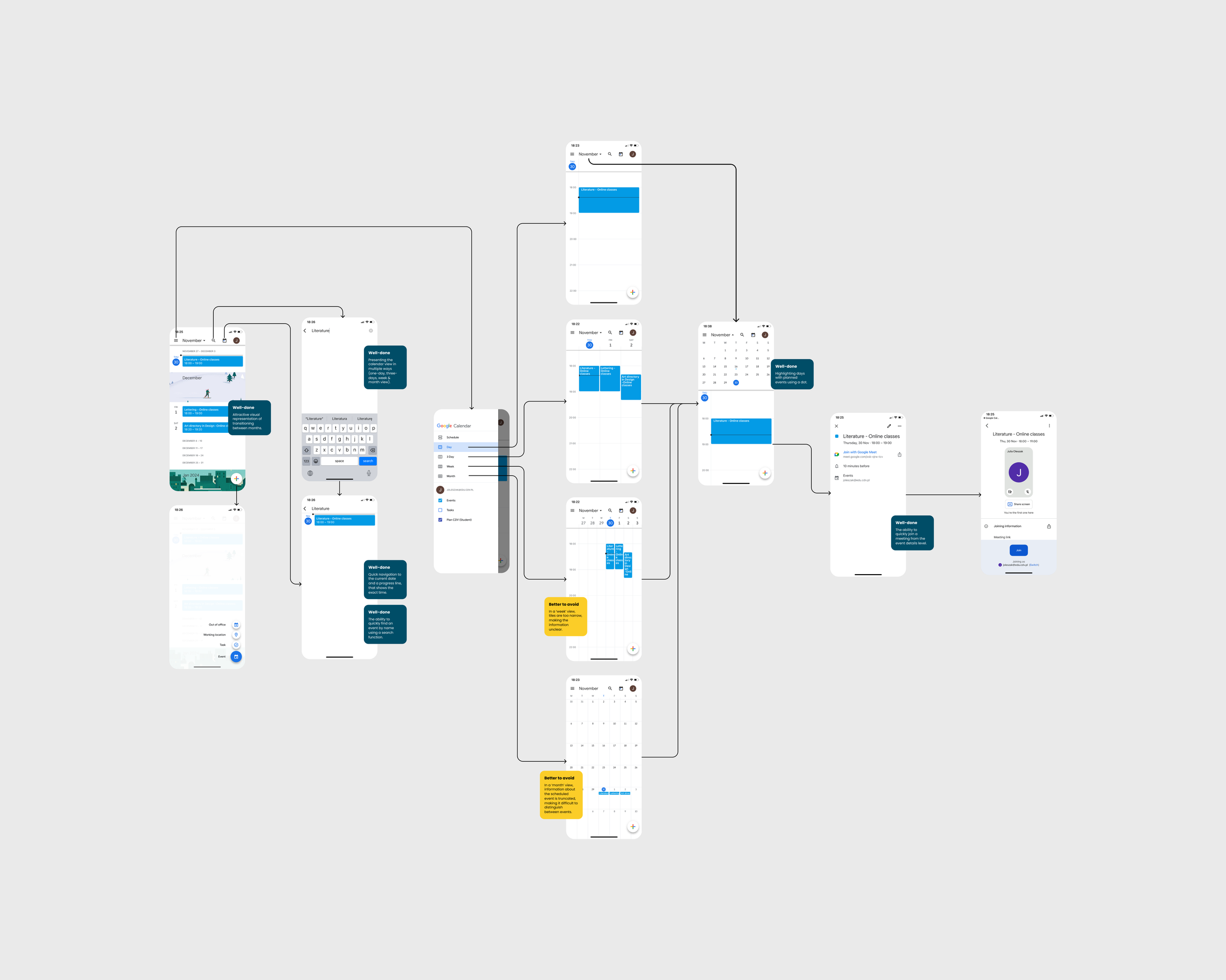
The Google Calendar app has visually appealing month views and efficient date access. It also has an effective search tool and features like expandable month views for easy event tracking. However, there are some drawbacks. The tiles are too small and the text is poorly divided in some views, which can make it difficult to read. Additionally, details about scheduled events are occasionally truncated, making it challenging to distinguish between different events.
Microsoft Teams
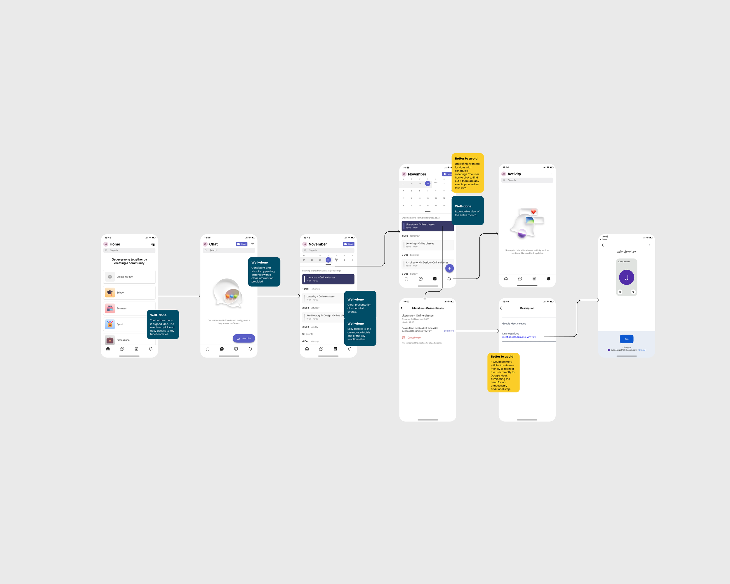
The Microsoft Teams mobile app provides quick access and clear presentation of planned events. However, user experience improvements are suggested, such as incorporating highlighting for days with scheduled meetings to eliminate the need for extra clicks and considering a direct redirection to Google Meet, streamlining the process for enhanced efficiency and user-friendliness.
PERSONA
Emphasising with the user
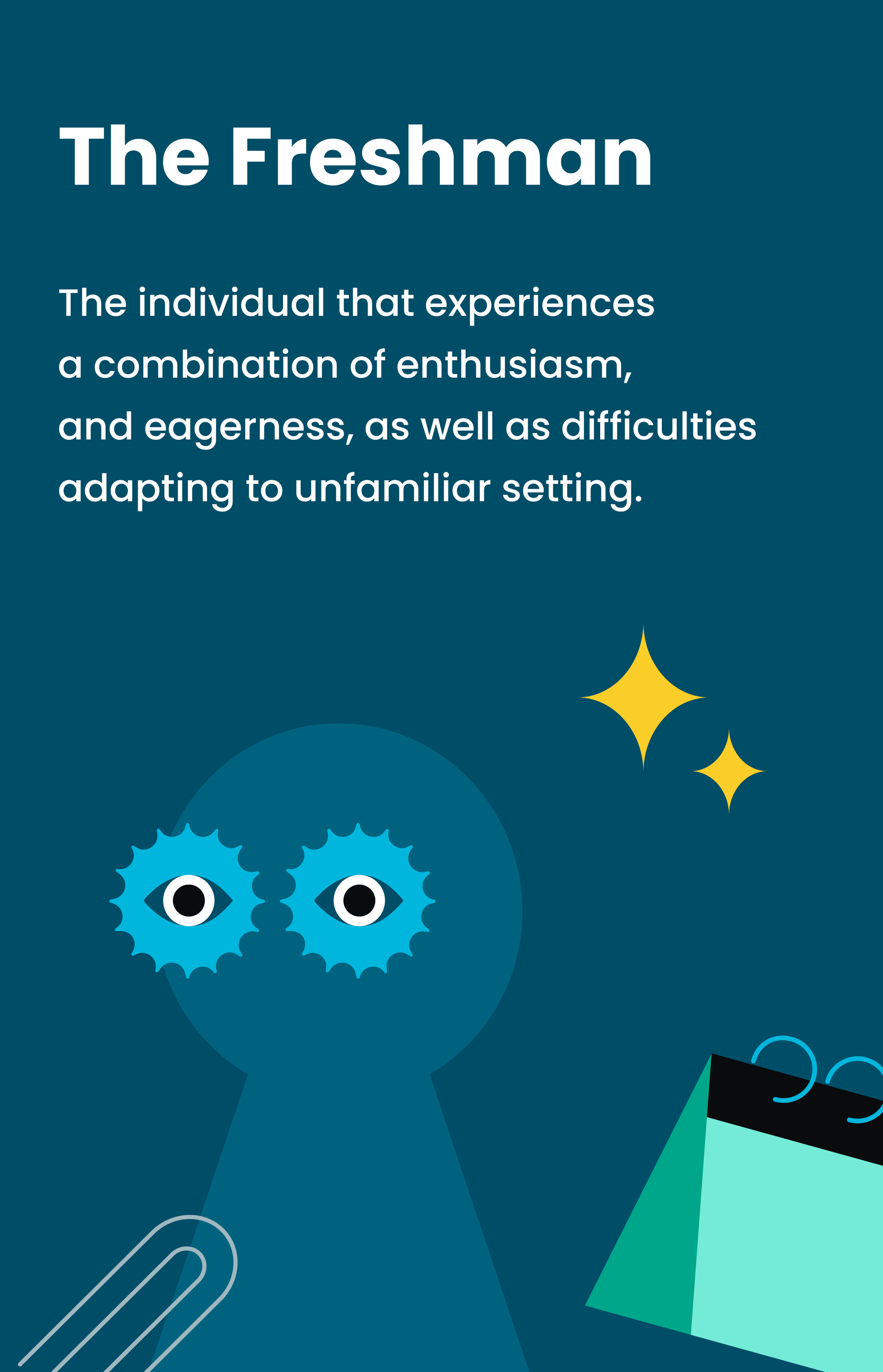
I’m interested in… exploring various academic and extracurricular activities.
I want to… make the most of the college experience, be present and well-informed.
My motivation is… to adapt to the new academic environment, seek tools that aid in efficient time management, and value resources that support the learning journey.
My tech exposure is… moderate, but I’m comfortable with common applications and open to exploring new ones.
I would describe myself as… someone who is eager to learn, adaptable, values simplicity, and wants to be a part of the community.
I may seek… guidance on navigating academic and scheduling challenges in the initial year.
USER FLOW
Creating seamless experiences
LOW FIDELITY DESIGN
Wireframes
HIGH FIDELITY DESIGN
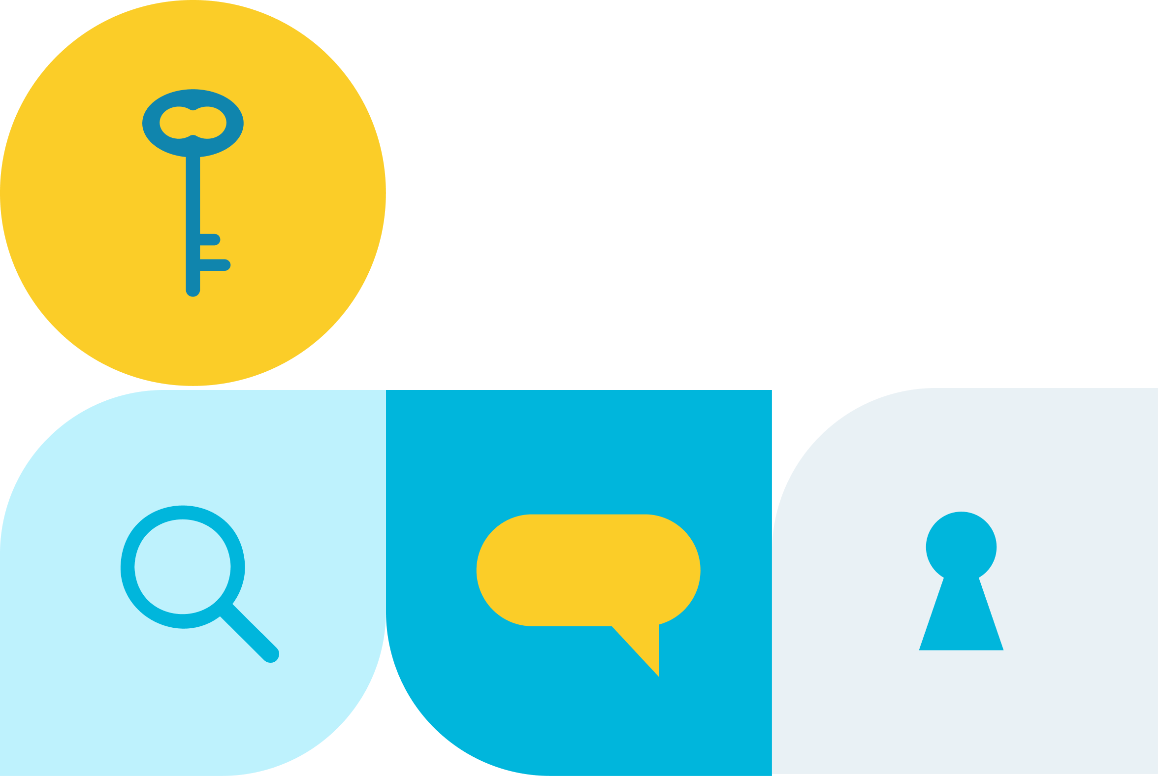
Application redesign